Sephora Collection
We gave Sephora’s in-house label a digital makeover that drives sales with a host of fun, useful and highly addictive tools.
Services
- Ideation
- User Experience Design
- Content Strategy
- Visual Design
Our guiding principle for Sephora Collection was this: Beauty can be as simple or as inspired as you want. If you know what you need, you’ll find it quickly. If you’re seeking advice or inspiration, we offer guidance alongside ample opportunity to explore.
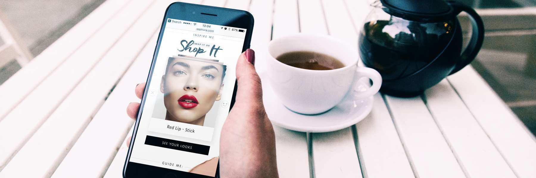
Shopping Makeup, Tinder-Style

For those seeking inspiration, “Swap It, Shop It” lets you swipe through looks with the brisk charm of Tinder. Swipe left if you’re not into a look. Swipe right if you like what you see.
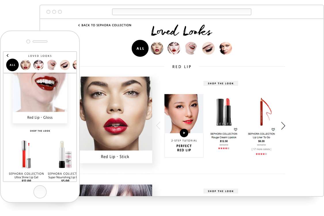
On desktop, clicks replace swipes (but the addictive nature remains). Once you’ve clicked or swiped to your heart’s content, shop all the looks you like from a single page.
Simplifying Beauty

Sephora Collection has hundreds of products — lipstick, lip liner, lip stain, lip gloss…the sheer volume can easily overwhelm. So we infused the experience with simple tools like “The Beauty Uncomplicator.” It lets shoppers find and compare products as they fill in the blanks, à la Mad Libs.
Sephora Collection is mobile-driven to the core, reflecting an audience that’s increasingly browsing and buying on their phones. Shoppers can compare products with speed and ease, exploring without getting lost. The ecommerce experience is a fitting blend of beauty and utility.
Sephora has led the pack in mobile beauty retailers... now it's taking a page from games and pop culture.
